Wednesday, May 25, 2016

IW 5-17-16

I'm a couple weeks behind after road tripping from the west coast to the northeast, but I got this little project turned out. I'm psyched that I got to use some cigar bands a friend gave me years ago. These pages were great fun. (Gratitude is for what I left in the west to spend the summer in the east with my In-laws... Standby for more colorful words as the summer progresses ; )


Monday, May 9, 2016

'My past' represented for my Wanderlust journal

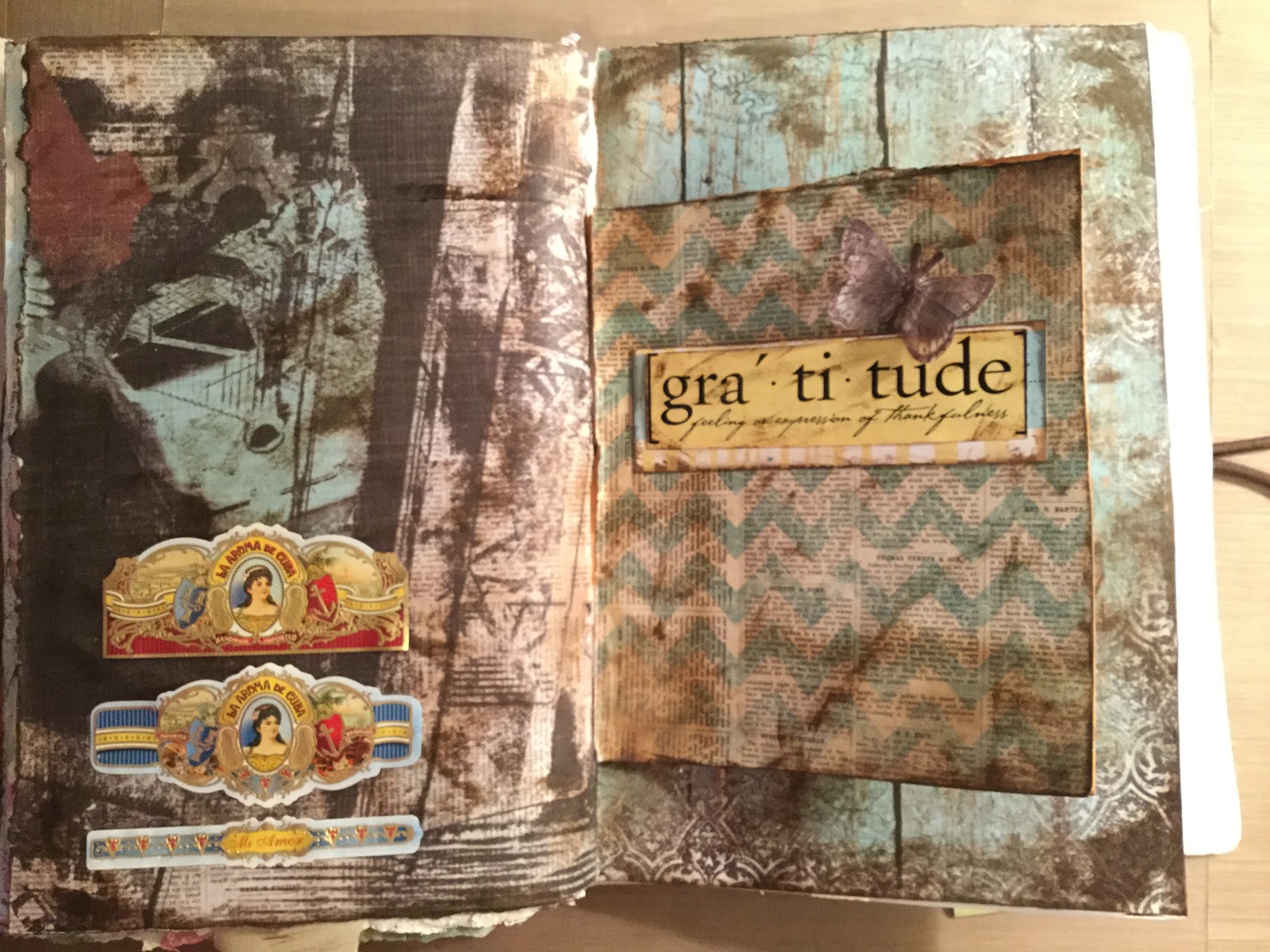
My past, journal page from Wanderlust. The background stamp says "life doesn't have to be perfect to be wonderful". So this page represents moving on and growing (butterflies) from my past, which is complicated for me, but fortunately a lot less so then most folks,  I think.
There are layers of stamping, covered by layers of tissue and gesso, along with stencils get and stamping on the top.


Sunday, May 8, 2016

Life is good art journal pages

IW art journal pages. I really like the texture in and out of the pages and the shading of the dots. It's also interesting to have the numbers in the background and the text print on the top layer, it really makes the depth of layers pop. The colors are an interesting combination and the gold text makes for an interesting pairing. 


Sunday, May 1, 2016

ADK park sign

I enjoy the vintage postcards and national park signs that remind me of family camping trips when I was a kid. This project has the outline of 16,000,000 acre Adirondack State Park in Upstate New York and it will hang in the hallway of our house. I had a great time drawing and painting it and working with my Dad to cut it out on the scroll saw. There will more of these projects in my future. I have many ideas rattling around the noggin!
O

WL image transfer & pop dots


This was a very interesting technique which included covering the background in the colors you see popping thought the dots, stamping the dots, then gesso-ing over everything but the dots. It produces a fun result. The image transfer is one of nieces college graduation photos. I would have liked more contrast in the transfer since the blacks turned out greenish. But this was another fun lesson and I will  try it again


Wanderlust family

I like the colors of this more subdued layout, which was a lesson from Wanderlust. Since I've been feeling like I get heavy handed with the brighter colors that I really like this was a good lesson for me to see that there is interest in subtly too. The photo is random and it was supposed to be my family and their story, but I can imagine that they looked just like this.